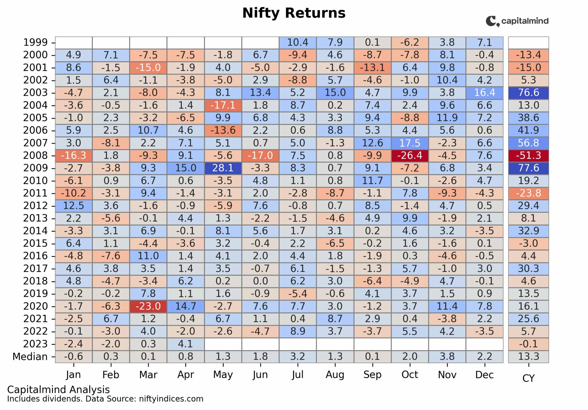
The month of October is nearly the end of the year, and it turns out we are way below where we were in the beginning. We have the second worst performance, year to date, since 2001 – the worst being the worldwide crash of 2008.
In fact, in the last six years, since 2005, this is only the second NEGATIVE year-to-date return for the Nifty.
Tags: Charts


Hi Deepak,
I am interested to see how November looks in the above chart . The previous chart you shared shows mostly positive November in last decade.
11.01.11 at 9:31 AM
Good analysis. The chart brings out the data very well(how do you make it?).
Eurozone crisis is still unresolved. The rally of 500+ seemed a little too early
celebration. I think unless the crisis get resolved we will see a decline more than reported here but I hope it should not be as deep as 2008. Keeping fingers crossed.
11.01.11 at 1:38 PM
Thanks! All Excel.
Yes the decline seems to be happening as we speak…
11.01.11 at 1:57 PM
This is a very good representation of a complex data point. An interesting thing to note in this graph is, every subsequent year after a fall, a reversal has been seen. Going by this, 2012 Oct will be positive. Moreover, the steps taken by EU countries to resolve the financial crisis, is also a very positive step for the world economy.
11.01.11 at 4:59 PM